

End-to-End Application
Smart Travel Assistant App
Breezy is a smart travel assistant app focused on simplifying trip planning by providing curated recommendations tailored to travelers' preferences, budgets, and interests. This app features a real-time updates, seamless itinerary integration, and intelligent suggestions for your travels. Creating a hassle-free and enjoyable experience.
Timeline
July 2026 - August 2026 (4 weeks)
*This project is a fictitious scenario, completed as a part of Simplilearn's UX/UI Design Program with Generative AI
Role
End-to-End UX Researcher and UX/UI Designer
Tools
Figma, FigJam, Typeform, Slack, Maze, Zeplin
Problem
This project involved designing a mobile application for a smart travel assistant. With so many different platforms to sift through it can be difficult to organize all of your travel information. Searching for relevant information while also trying to align plans with ones preferences, budget, and interests can be overwhelming. With these frustrations, Breezy is searching for a way to improve a travelers experience.
Discovery
Research
Breezy aims to improve its online shopping platform to provide a seamless, personalized, and enjoyable experience for its customers. The challenge was to identify pain points in the current user experience and design solutions that resonate with the brand's minimalist ethos. In order to conduct this research, I created a questionnaire by using the program Typeform. This program helped me collect users answers for better organization and identification of the key issues. After reviewing the surveys results I researched other applications that competitors for this new platform.
01. Preliminary User Survey
My first action was to conduct a survey in order to learn what were some of the struggles people face when arranging their travel plans. The preliminary survey consisted of twenty-one questions covering the users needs, pain points, and other user insights powered by Typeform.

02. Competitor Analysis
After conducting the survey I researched existing applications that serve as competitors. TripIt was the first program I found. It is a program that automatically creates an itinerary when you link your flight, hotel, and car rental confirmation emails. The second was Mindtrip. This platform uses AI tools to generate personalized recommendations, build custom plans, and store booking receipts. And the final application is Tripsy. Tripsy organizes your reservations, tracks real-time updates, and maps out your daily schedules.
TripIt
Mindtrip
Tripsy


03. Affinity Mapping
With the insights from the survey I found some reoccurring patterns on pain points users have while trying to book their next adventure and features they want in order to improve their experience.
So many Platforms
With all of your bookings on different platforms it can be challenging to organize them all. A one-stop-shop for all of the travelers information would be perfect.
Budget is Big
Traveling can be expensive. Having a tool that can balance and manage your personal budget can keep one on track.
Plans on Plans
Flights, hotels, events, and more can fill up your schedule fast. A detailed itinerary that organizes all of your bookings helps ensure you meet all of your deadlines.
Sharing is Caring
Whether its sharing with family or with you work, the ability to keep others updated on your bookings, budget, and itinerary is important for everyone.
Keep me Informed
Updates regarding any change is a necessity. Whether your flight is delayed, appointment is moved, or vehicle reservation was canceled, having a highly reliable notification system is a must.
Something New
While traveling some people want to explore the area and may not have concrete goals on where to go. Recommendations on events, locations, and other activities happening can improve your overall experience.
Define
01. User Personas
While reviewing my survey results I found their needs for using a booking platform varied. Through the results I created four different user personas.

“Vacation Traveler”
Age: 34
Occupation: Marketing Manager
"I need a space where I can organize all of my bookings and keep a budget. An easy to use platform that has all my information is important to my satisfaction."
Sarah
Bio
Sarah loves traveling but finds trip planning overwhelming. She struggles to sift through countless websites and apps, searching for relevant information while also trying to align plans with her preferences, budget, and interests. Without a tailored solution, Sarah feels stressed, spends excessive time on planning, and experiences diminished excitement for her trips, making the entire process inefficient and frustrating.
Needs
- Preference/interest space
- Scheduling page
- Budgeting tools
Goals
- Combine her bookings
- Space for budgeting
- Itinerary space
Motivations
- Organization
- Convenience
- Personal preferences
Pain Points
- Takes to long to plan
- Too many platforms
- Inefficient organization
_edited.jpg)
_edited.jpg)
_edited.jpg)
02. User Flows
To get an idea on how a user may navigate through the app I created a user flow. Focusing on how they might navigate to their budget and update the information.
.jpg)
03. Site Map
After establishing the user flow I designed the apps overall navigation by making a site map.
.jpg)
Ideate
Low-Fidelity Wireframes
I began with designing low-fidelity wireframes within Figma to see how might be best to arrange the information. Building how a user will navigate through the app. Once I made a solid layout for the elements I move onto the branding. Focusing on the typography and color palette.


UI
With this application the goal was to create a space where the user can easily organize all of their travel bookings. This led me to the title Breezy. With all of the bookings you need to organize this platform intends to make every travelers journey easy breezy.
Branding
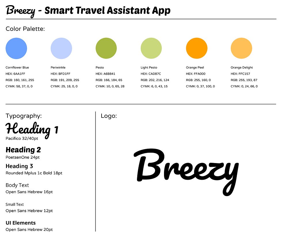
01. Logo

02. Color Palette
For the color palette I chose to focus on secondary colors. The dominant color is a periwinkle blue. Giving a calm light feeling for the user. This color is easy on the eyes. This makes using the app low stress. The secondary color is a light pesto. The warmth in the tone gives the user a calm and inviting feeling. As for accent color I chose a bright orange. This was used to draw the focus of users, guiding them to certain buttons or features.
03. Typeface
With the typography I wanted to continue the calm but vibrant feeling presented in the color palette. For the logo I used Pacifico. A cursive styled font with a bold, thick font weight. The cursive style complements the calm and flowing qualities of the dominant periwinkle blue. The boldness of the font weight balances the vibrance of the bright orange accent color. These same feeling continues into the second font PoetsenOne. A heavy weighted font with rounded edges.
04. UI Library
When designing the components for Breezy I chose to continue the roundness from the fonts into the buttons. The orange buttons as well as the login, search, circle, and star buttons were designed by me in Figma. The primary icons are not original designs but were sourced from a free platform called Flaticon.


Validate
Usability Testing
The final stage of designing Breezy was to test the usability with users. To preform this task I used the program Maze. Users were tasked with navigating to several features including profile, budget, and booking details. For tasks assigned the completion success rate was 100%. User feedback showed an overall satisfaction with the navigation and design.
